
| Client: | Market One |
| Activity: | Commercial Consulting |
| State. | New Positioning |
| Company Status. | Repositioning |
| Year. | 2024 |
Market One came to us asking for “a new website.” Two meetings later, we all saw it clearly.
Scope of Work
Research & Analysis
Brand Strategy
Visual Identity
Verbal Identity
Communications Plan
Website Design
| Team Funka: | Project Manager Brand Manager Creative Director Graphic Designer Copywriter Web Designer Web Development |
| Duration: | 3 months |
A Chronicle of Success Born from Change
From consultant to consultant, we understood each other. The client truly valued that pause, which without a doubt impacted the entire project and both teams. We reshaped the scope, moved deadlines, and kicked off our branding strategy process with all the meetings, workshops, benchmarks, data analysis, and everything in between.
What Strategy Revealed
“Companies today need consultants who move faster, who can read reality better and with fresher frameworks for something that is no longer fixed but always becoming—and will be something else in 18 months.”
This excerpt from the Manifesto we created together with Market One sums up a central aspect of the branding work.
The consulting world of the past is led by big names that aren’t always the best allies. Market One needed to position itself as the consulting firm that offers a practical, end-to-end commercial approach. With a leaner structure, with a fresher tone.
What seems clear today, we discovered step by step: interview after interview, workshop after workshop. Once again, our job was to ask the right questions, to listen carefully, and to moderate interactions in order to find those points of connection at the company’s core, expressed through different voices. We put it all into a brandbook that defines the mindset and tells it in a simple, charismatic, and expert way.
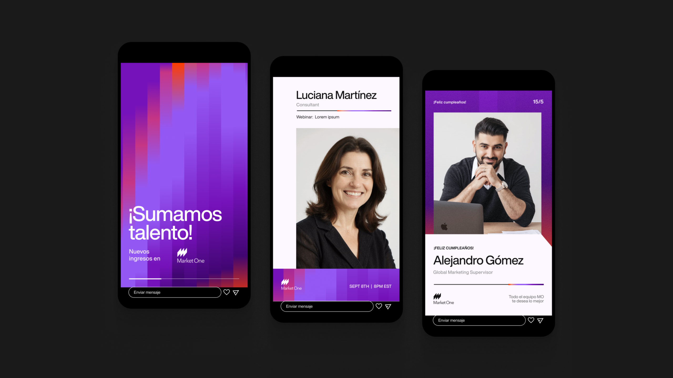
Verbal Identity
The Verbal Identity work was also deep, enriched with each round of feedback. We defined a style that was approachable, relaxed yet assertive—one that, just like the Visual Identity, hit the right balance of disruption.
We developed a tagline, storytelling guidelines, and practical examples of messaging for different audiences. A true manual that works as a tool for the company’s communications team.
The tagline wasn’t born overnight.
What we knew:
01. Language
In the middle of an internationalization process, the tagline had to be in English. But it couldn’t be overly complex for those whose first language is Spanish.
02. Style
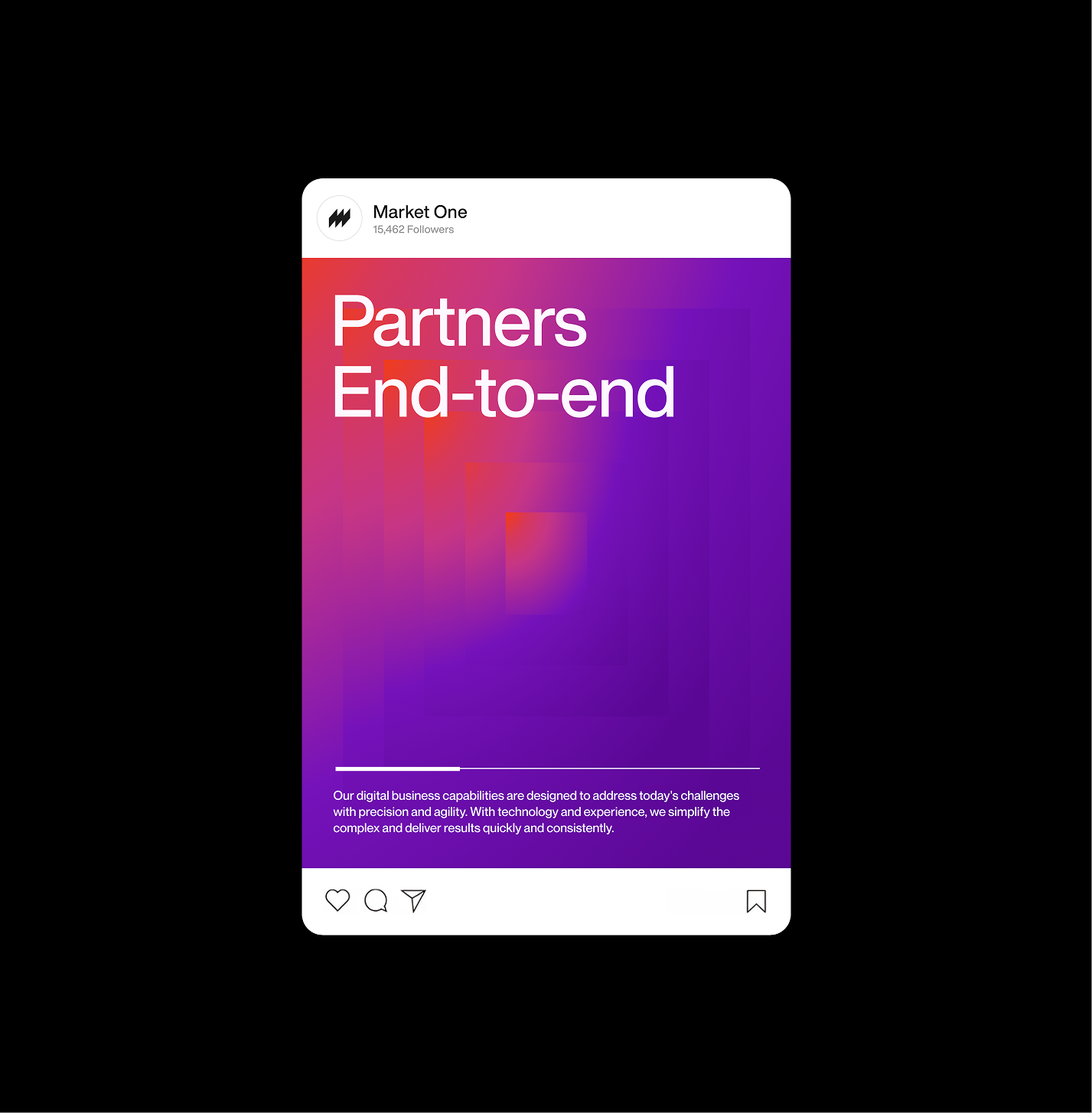
2.1 The first option was a descriptive slogan, serving as an explanation in just four words of what the company does and how it does it. With limits, of course. We proposed Partners End-to-End. The Funka team was convinced, and part of the Market One team believed it was the right choice, but they challenged us to go further.
2.2 For the second option, we aimed for something emotional—something that would transmit the passion we saw in the company. And we found the right words to make clear that their focus is the commercial process, from start to finish.
That second option was the winner, and today it’s the slogan they love and use daily:
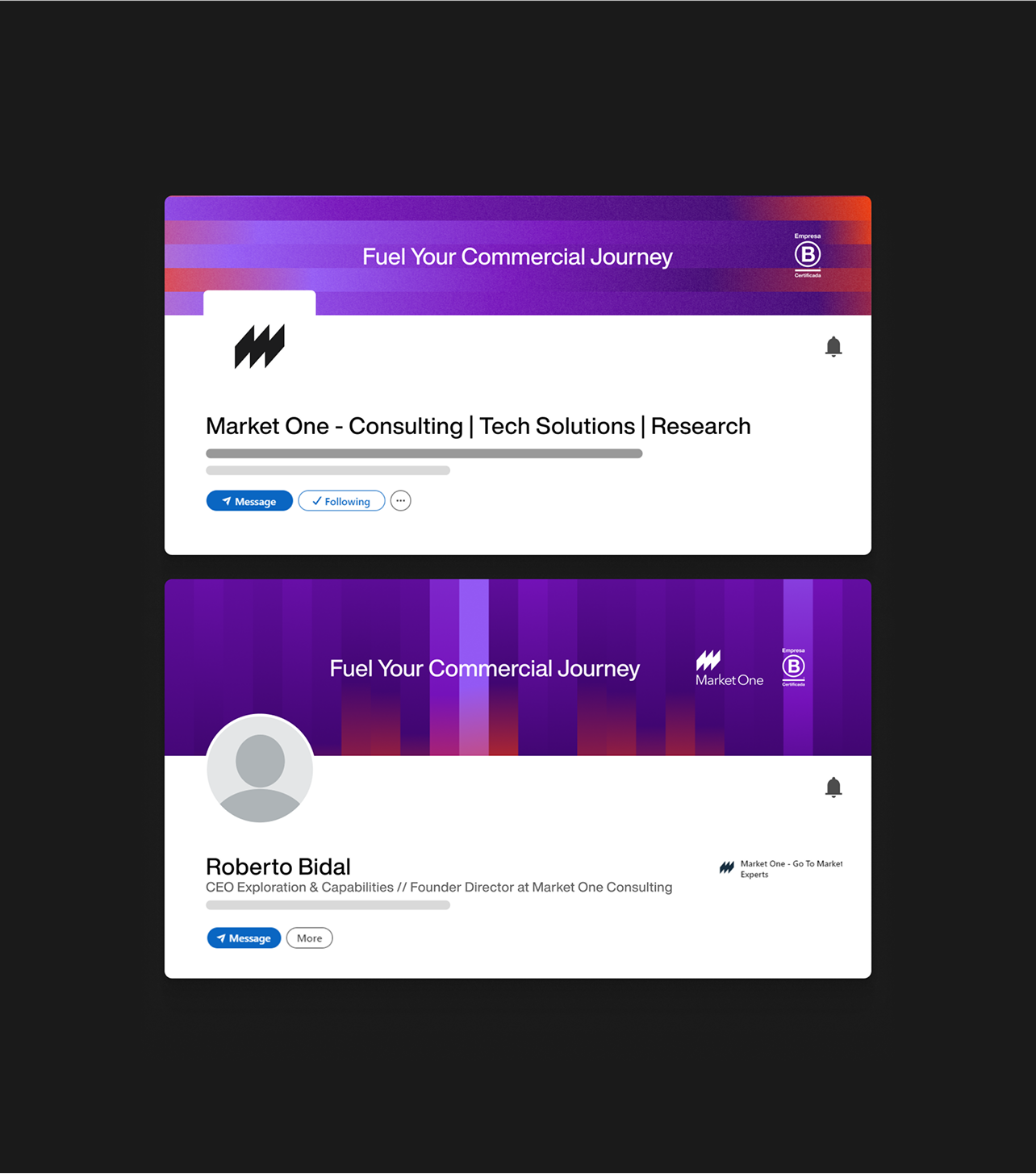
Market One – Fuel Your Commercial Journey
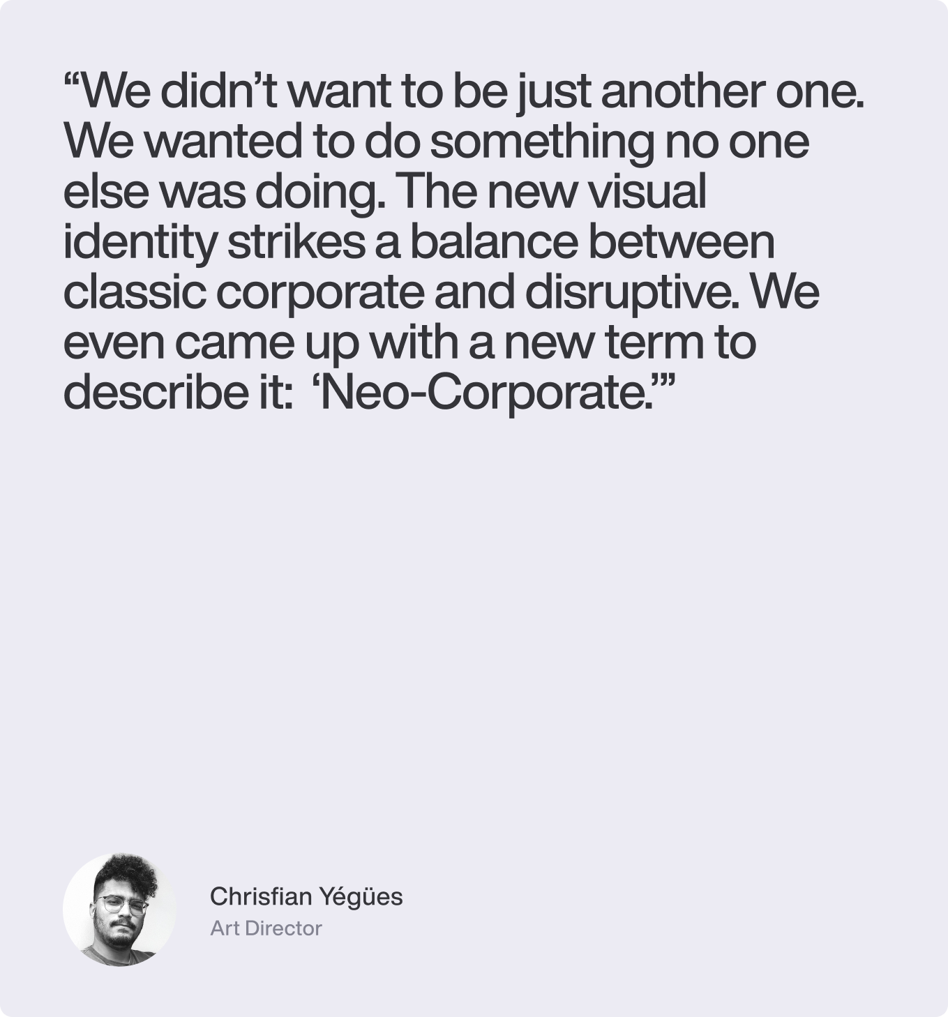
What We Mean by “Neo-Corpo”
The status quo in the sector is very obvious. Everyone communicates in pretty much the same way. The goal was to find those graphic elements (color, textures, patterns, etc.) that would make Market One stand out from the crowd—without losing connection to the sector.
We loved the result—with its disruptive and energetic side, while maintaining sobriety and professionalism. We created a visual identity with a wide, replicable system, easy to use no matter who applies it.
Gradients bring a captivating, abstract style. The typographic play with disruptive grids gave us the sober feel we were looking for in a corporate brand.
Behind the Consensus
With Market One, debate was constant and enriching. Each delivery brought feedback that sharpened the final result.
For example, we had different opinions about how disruptive the visual identity should be. The client thought we should go for something extremely novel and “break it all,” while we leaned toward moderate disruption. By breaking just enough, we achieved distinction while fulfilling the brand’s need without pretending to be something it wasn’t. We stood firm, argued our case, and the middle ground won.
Where we did concede was in color. When we proposed the moodboards, we saw two clear directions, both valid. While we leaned toward the cooler palette (with blues, light blues, and salmon), several of the partners fell in love with the other option: an indigo/violet shade that was rarely used in the industry. The final result makes it clear which way we went: we listened to the client.
Finally, the Website
Without a doubt, this was the project within the project. What more can we say that you can’t see for yourself?
Even though content creation, in this case, was handled by Market One’s internal team, we had everything to do with decisions around architecture, UX/UI design, and development of the new site.
We invite you to explore it and see how this brand now expresses its promise:
“Fuel Your Commercial Journey.”
🔗 marketone.co